Visual identity is created by the way that the Athletics Centre at Trent, as an organization, is represented visually – symbols (logo), colour and typography – in any and all materials we produce and distribute.
It is especially important to have a consistent approach to visual identity as a means of establishing brand recognition in the community. Branding is also important because the Athletics Centre identity is part of a family of University logos and brands, including Excalibur Camp, varsity, etc. These guidelines will help clarify how these brands are to be used and how they can work together to support the mission and vision of Athletics & Recreation at Trent University.
Below you will find a number of items available for download.
Athletics Centre LogosTo protect our trademark and our identity, it is critical that our masterbrand is used consistently and correctly. Here are some examples of what not to do with The Athletics Centre logo:
When possible, the logo should always appear as full colour. White type is required when it appears on dark background. FILE FORMATS PNG/JPG files are suitable for e-mail and website applications, as well as more informal documents. JPG files should never be printed at a large scale. EPS files are required for most professional print jobs, particularly for outside designers and printers. For large applications of the logo, or for alternative file formats, please consult with the Graphic Design & Marketing Assistant. |
|
|||
Excalibur LogosTo protect our trademark and our identity, it is critical that our masterbrand is used consistently and correctly. Here are some examples of what not to do with the Excalibur logo:
When possible, the logo should always appear as full colour. White outlines is required when it appears on dark background. FILE FORMATS PNG/JPG files are suitable for e-mail and website applications, as well as more informal documents. JPG files should never be printed at a large scale. EPS files are required for most professional print jobs, particularly for outside designers and printers. For large applications of the logo, or for alternative file formats, please consult with the Graphic Design & Marketing Assistant. |
|
|||
PostersAll messaging posted within the building should be created with the poster template and may include a large banner image for interest. Messaging should be concise and large enough to read from a distance of 5-ft. POSTER LOCATIONS Similar to external posters, there are limited areas that have been pre-approved for postering by Athletics Centre staff. These locations include:
In certain circumstances (i.e. special events, cancellations/closures), it may be possible to poster in additional locations. These locations include:
|
||||
LetterheadAll important official documents and postings should be written on the current Athletics Centre letterhead. All outdated templates are not to be used. |
||||
FontsHEADINGS SUB-HEADINGS Body Copy |
||||
Colour Palette
|
||||
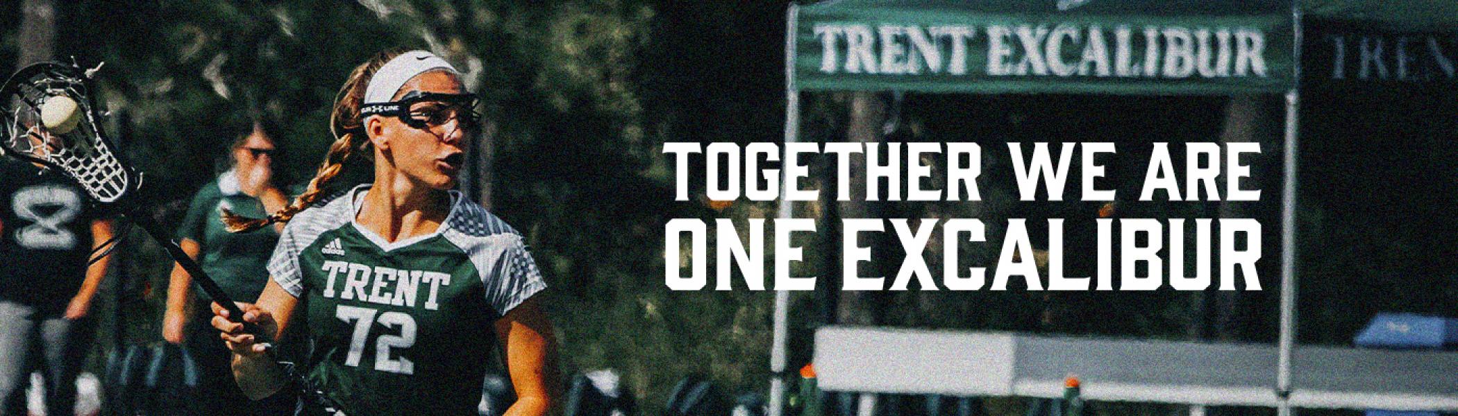
Photography GuidelinesThe Athletics Centre’s photography should allow four key points – emotion, activity, diversity, and collaboration. Colour photography should be desaturated and lighter, in order to bring out Trent’s brand colours. Avoid underexposed images and dark colours. PEOPLE Photos of people should show a range of emotions (e.g. positive, curious, engaged, attentive, etc.) Photos of objects and actions should emphasize collaboration and activity rather than just the subject (e.g. the weight room floor, sporting events, individual workouts, etc.) OUTDOOR Outdoor photography should be taken on campus and in the surrounding community. Shots should be landscape in orientation and provide space around subjects. Shots should always include people (if possible); and emphasis should always be on the emotional impact of the environment on people. INDOOR Indoor photography should focus on single positive subject matter. Group shots should be taken at a wider angle to show collaboration and the context of their surroundings. |
||||


